

Wow, I can’t believe we are on week 3 already. I am already starting to get nervous about coming up with more compelling topics for each week. I have a list that I am working through but I could really use your help. I want to write about the things that you all want to hear about. Please leave a comment below on a topic that you are interested in and I promise I will write about it (well, only if it's a good idea).
Real quick, I want to thank all of you who are reading every week, I see you and appreciate the support. To those of you who are subscribed, you are my favorites. The outpouring of support from texts and DMs that I have received has really calmed my fears about this newsletter and I am very grateful to you all. You are the reason I will keep writing.
I promised that I would try to keep these newsletters short and I feel like I have failed in that goal thus far. I will try my best to keep this article to a reasonable length, but it's actually pretty hard to stop once I get started. And I don’t know about you, but last week's newsletter on inflation got me fired up, and I am trying to keep that energy this week.
As you can probably tell by the title (or maybe not, I haven’t come up with a title yet) this week's newsletter is on a topic that is tangential to finance but is not necessarily directly related. I hope that’s okay with you, but if not, too bad, get your own newsletter.
This week I will teach you how to lie. I am not talking about that simple impulse that is ingrained in us, that inevitable deception that is not learned (it’s amazing that babies lie as soon as they learn to talk). I am not talking about your average lie. This newsletter will teach you how to control people, how they think and act, and what they believe is real. Today I will teach you how the government lies: with statistics.
As a disclaimer, I am not advocating for this tactic. I do not recommend you use it or ever attempt to control other people. I am here to teach you how to recognize it, call it out, and ultimately think for yourself, do your own research, and come to your own conclusions. I am here to show you that many things in your life that are presented as facts are not necessarily true, or are only true in the correct context.
This newsletter will come very close to the border of politics, as politicians are generally the people that have the most use for lies, but I will try to stay as far away from that border as possible. I do not want this newsletter or this article to become politically polarizing as you do not care about my politics and I do not care about yours. Depending on your own political views I am sure that many examples of lying with statistics will come to mind for “the other side”. I am here to tell you that “your side” does it as well. Everyone does.
With that in mind, buckle up, because here we go.
What is a fact? Generally we think of a fact as something that is objectively true. Something measurable and repeatable. The sky is blue, the birds sing, you will pay Uncle Sam his taxes.
But what about the man who is colorblind? What about the woman who is deaf? What about businesses that make millions of dollars in revenue but do not pay taxes? What is the truth for them? In general, I am not an advocate of “your personal truth”, but I do recognize that many things are narrowly true. That is, some things are only true in very specific contexts.
One thing that has always felt like a safe haven and shielded from manipulation are numbers. 2 + 2 will always equal 4 (stay out of my DMs math majors, I don’t want to read your proofs). But something odd has been happening with numbers in recent years, most commonly seen in political discussions and debates. It often seems like both sides have numbers to back up their assertions and numbers that “prove” that their policy recommendation is the correct solution. Too often people’s initial reaction is to dismiss the other side as liars and to believe that your side is telling the truth, because after all, you are the good guy and they are the bad guy.
I am here to tell you that they are both lying (kind of) and they are both telling the truth (kind of). They are taking statistics out of context or using too many, often unrealistic assumptions. The central problem is that studies, polls, and almost every other method of collecting data is biased.
Think of the last time you reviewed a restaurant on Yelp or Google. I am willing to bet that unless you are a compulsive Yelper, you left a review of either 1 star or 5 stars. People generally only participate in giving a review (in this case the study of the restaurant's performance) if they had an exceptionally good or exceptionally bad experience. Most people do not bother to leave a review unless they are wow’d in either direction. This is called self-selection bias and is one of dozens of biases that creep into almost any sample of data that is collected.
Here is a non-exhaustive list, with examples, of some statistical biases if you are interested: click here
The above example is to show that many statistics are already inherently biased, but now we are going to go a step further, when people use statistics dishonestly. As opposed to simply citing unreliable data, some people use statistics to lie. The example that I provide below should look familiar as it pertains to last week’s newsletter. This was the statistic that irked me enough to write a whole newsletter on the topic. I hope you didn’t get enough inflation last week, because here we go again.
Below is a chart showing inflation that you have probably seen on your favorite news outlet.
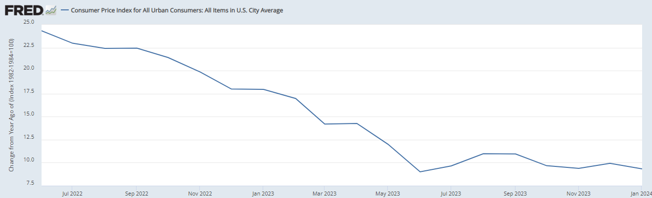
I know that the Federal Reserve and the Biden administration certainly boast about this chart. It usually comes with headlines like “prices are finally falling” or “inflation is cooling off”. While the latter assertion is technically true, the former is misleading to the point of dishonesty.
The rate of inflation is falling. However, unless you read the fine print you might miss that the above chart is showing the change in inflation from 12 months prior. This means that prices are not in fact falling (despite the downward line) but that prices are rising at a slower rate.
In fact, if we look at this chart from another angle (see below) it tells a completely different story.
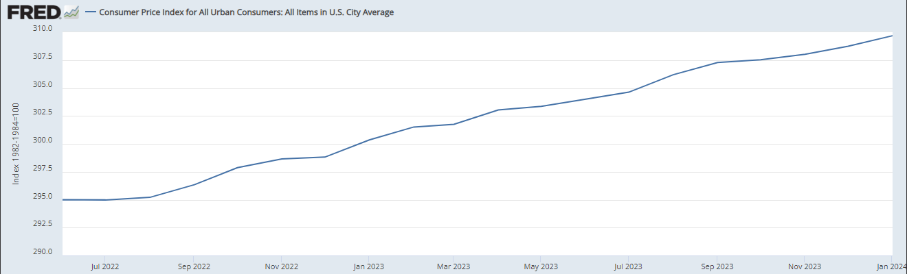
This is the same chart; the same data but shown through a different lens. This chart shows indexed inflation over the same time period as the first chart. In my humble opinion, this chart more accurately depicts the effects of inflation since June 2022. While the line has begun to level off, it clearly shows that prices are still increasing and it also shows why Americans are still struggling financially despite “cooling inflation”. Americans have not received a break and they certainly are not feeling the drop in inflation depicted in the first chart shown.
This is just one example of how to change the narrative using statistics. Data is easily manipulated and if you are not looking closely you are too. How many people do you know that think prices are actually falling? I know for me it's quite a few. They are in an interesting position where they truly believe prices are falling but still have a sense that their dollar doesn’t go as far as it used to and they don’t know why.
You can find examples of this data manipulation every day. You can see it in the unemployment rate, “created” jobs, and wage growth to name just a few in the sphere of the economy. But this data manipulation is used to create narratives in essentially all of the hot topic areas in politics. Narratives are created and propagated on both sides of the political aisle on everything from gun ownership to abortion.
It's hard to know what to believe when both sides have numbers and statistics to back up their claims. As mentioned above, it usually ends up becoming an echo chamber and reinforcing previously held beliefs. Everything that doesn’t fit with your side’s narrative is called misinformation.
It's pretty scary that we don’t know what to believe. We are constantly bombarded with information and are being pulled in different directions by people with different motives. It's overwhelming. I am not here to tell you which side is right, or which side is worse, or which side manipulates data more often. Frankly, I don’t know and neither do you. The best we can do is assume that both sides are fudging the data and the truth lies somewhere in the middle. I encourage you to go forth and be skeptical. Question everything, especially when statistics seem to be bullet proof because they rarely are.
I hope this newsletter has been enlightening to some degree and I hope that this shorter length is easier to digest than the past couple of weeks. Please let me know which length you like better in the comments. I promise this is as political as this newsletter will get and I will never advocate for one side over the other.
As always, thanks for reading and I hope you will subscribe. It helps more than you know.
Click on the links below to read more from Behind the Wall
Would be interested in some more examples of misleading statistics in finance, politics, Econ, etc.
Great job! Now do the money supply and how we've printed 80% of all the money ever in existence in the last few years. America's biggest export is the dollar!